DataPlot
DataPlot
Rating (1)
Reviews: 3
Category: Education
This view shows the data entry form and versatile Load Data window. On the right side of the form there are there radio buttons that are used to select the graph type - Line Plot, Bar Chart or Pie Chart.  Once selected the form will change to handle the graph type. On the left side are shown three numbered buttons, one for each dataset. Tapping on the button will display the data for its dataset where edits can be made. A maximum of 10 datasets are allowed in a graph type. Once the data has been entered, then tapping on the Plot Graph Type button in the lower right will change to the graph view.  The data can be saved in an .xml file or individual datasets can be exported, copied to the clipboard or shared as tabbed delimited text.
Graph View showing 10 datasets with different symbols and opacity. Symbols are also shown in the legend.
Graph showing multiple pie charts and the Color Selector popup. The Color selector can be used to specify the color and opacity of each Item-Name in the pie charts. In addition, the colors and opacities of the Heading, Legend, Caption and Pie Slice labels can be colored.  Also, on the right side are options for customizing the pie chart view. In the Pie Chart Settings (not shown) will be a list of Headings, Legends and Captions for the pie charts as well as an option to show or hide individual pie charts. Pie charts (collection and selected) can be printed and exported to files, to the clipboard and shared with other applications.
Shows User function input view and on the right side list of selectable  math and shape functions
Graph View showing the results of calculating a user function.
This view shows the results of automatic processing of text input from a file or clipboard. When the automatic processing is not sufficient then the Map Columns popup (shown on the left) can be used to refine. Columns can assigned to datasets and they excluded.
Overlapped plot of multiple line datasets.
This view shows three datasets in a stacked bar chart format. In the upper right there is a drop-down box for changing the format by selecting a Side-by-Side or Overlapped. Below the drop-down box are two sliders for changing the width of the bars and the distance between the bar groups. A group is a set of bars at an X-Value. In addition, colors, legend and caption can be set for each dataset. Datasets can be hidden or shown via the toggle button. There are more options and settings available through the other panels.  Bar Charts can be printed, shared, copied and saved to a file.
Multi-graph view showing individual bar chart graphs. Checking 'Stack Graphs' will change the view showing all graphs stacked with each graph being maximized in the horizontal direction. The options at the top of the view are used to print, share, copy and save individual graphs or the entire set of graphs. Also, a slide show option can be selected where each individual graph is full view for analysis and presentations.

Description

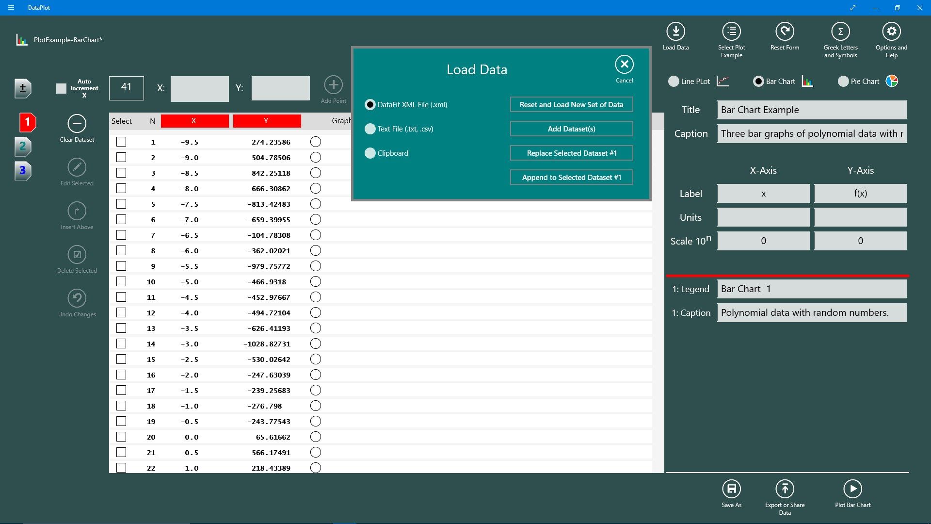
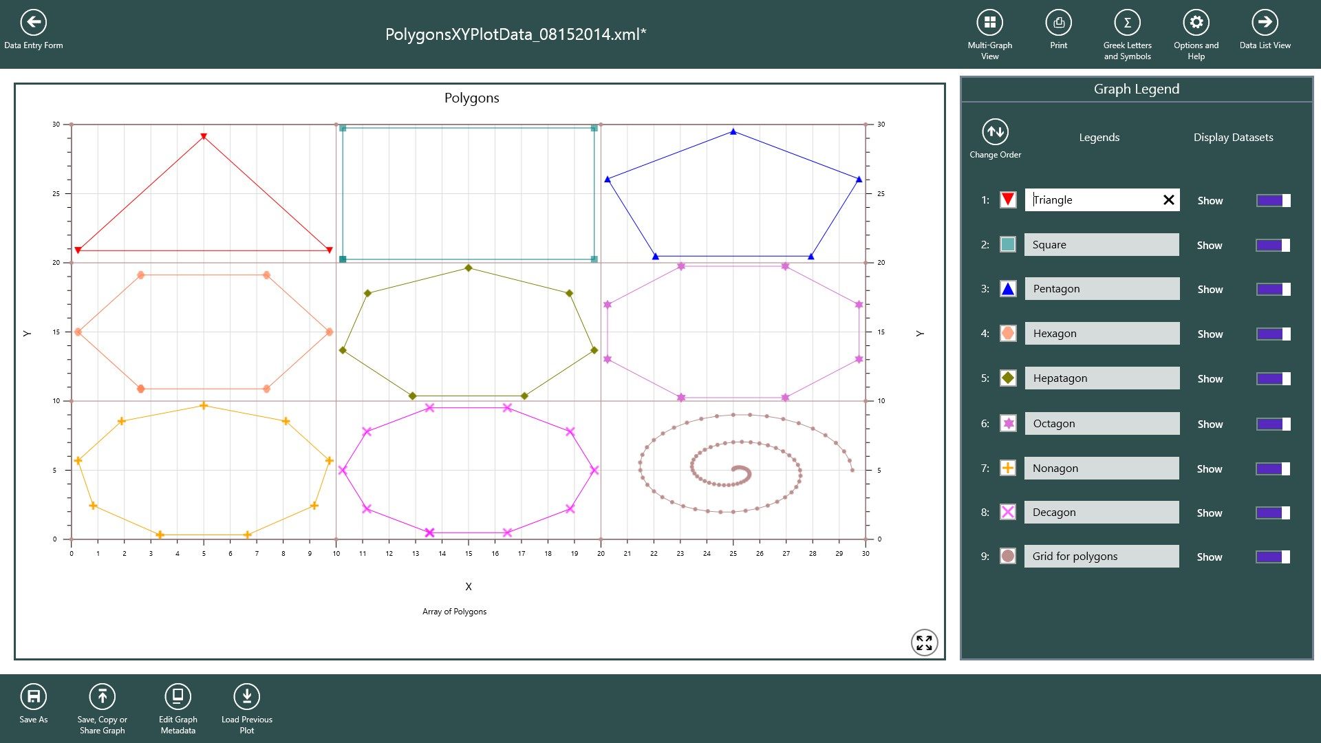
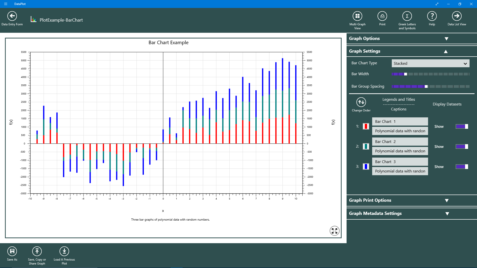
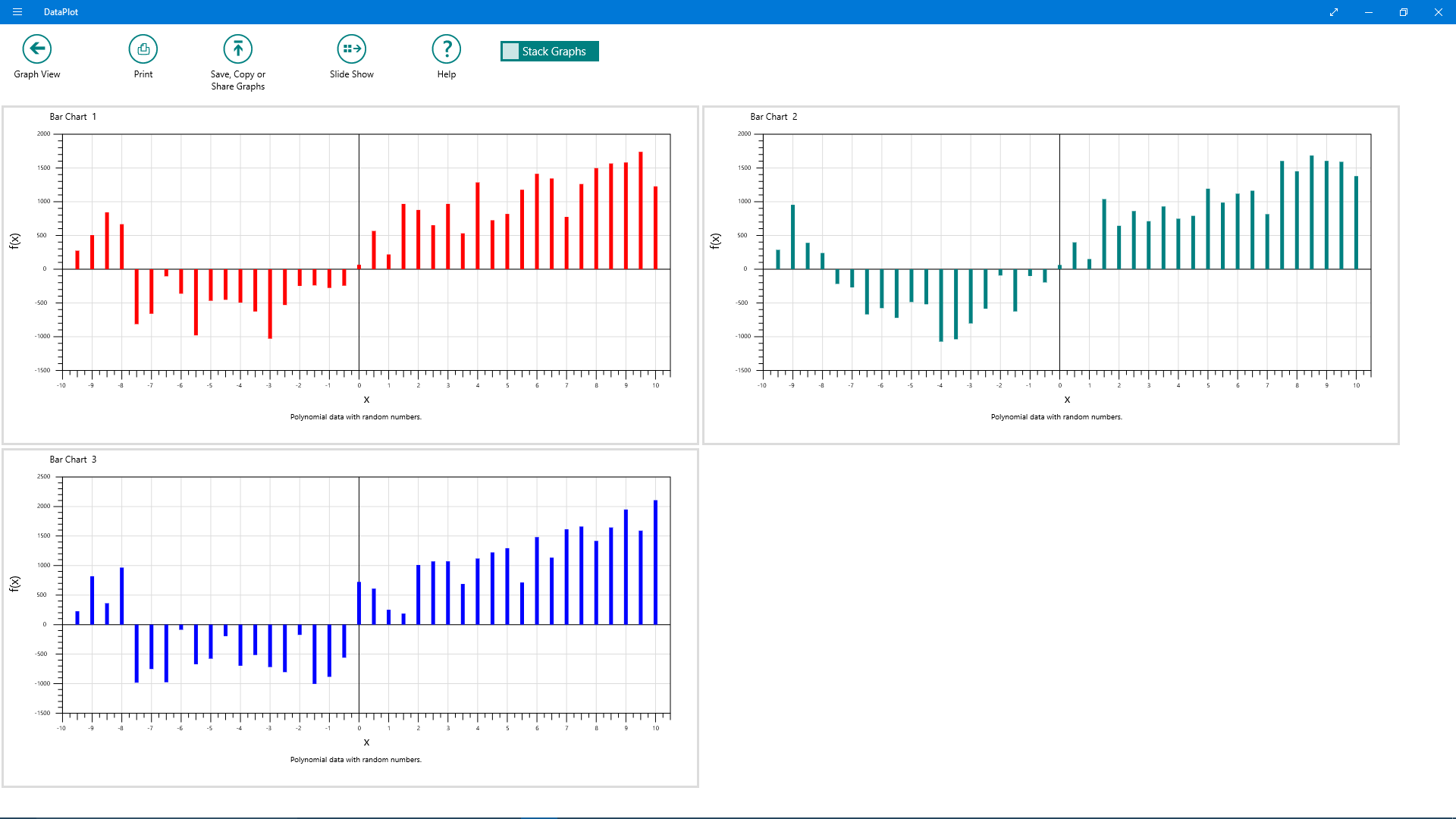
Data Plot is a general purpose plotting application that supports Line Plots, Bar Charts and Pie Charts and displays of user parameterized functions. Data can be entered manually, loaded from text files and the clipboard with tab, comma, semicolon and space delimited fields and with fixed width columns, saved DataPlot formatted XML files or from one of the available parameterizable internal standard math and geometric shape functions. In addition user defined functions can be entered and evaluated using their parameters to create a dataset. One to ten datasets of X,Y values can be plotted simultaneously in any one of the graph types. Data points within each dataset of a line plot can be labeled. A collection of X,Y values can not only represent data but they can be used to render shapes such as polygons, roses and spirals that are generated from geometric shape functions. Since plots of datasets can be overlapped, sets of mathematical shapes can be used in innovative ways to create objects that begin to show the power of mathematics in graphics. Graphs are customizable where data points are represented by selectable and sizable symbols. Lines connecting data points can have their thickness and color selected and closed figures may be filled with colors that can have their opacity value set. Individual graphs can also be displayed in a slide show format. Graphs can be printed, copied to the clipboard, saved to .png formatted files and shared with applications that accept bitmaps such as PowerPoint, OneNote or WinWord.

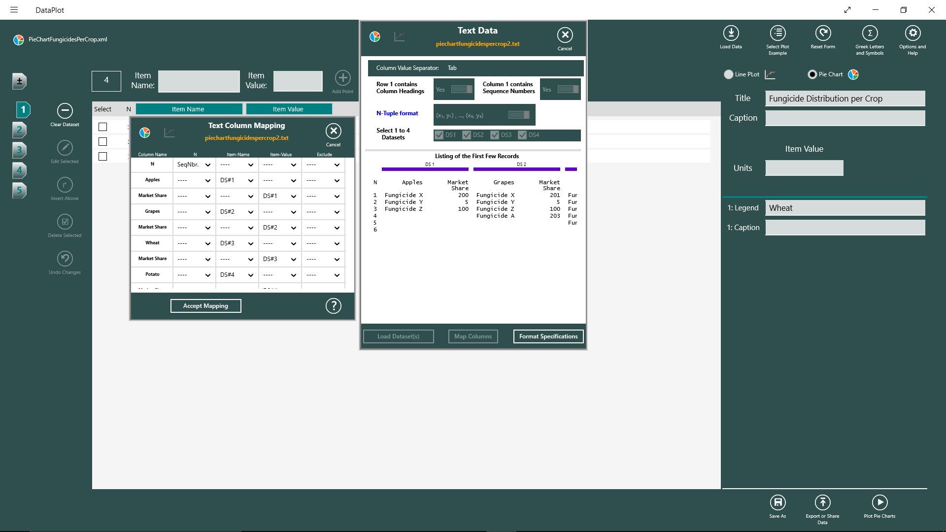
  • Easy entering, editing, loading and adding of multiple datasets.
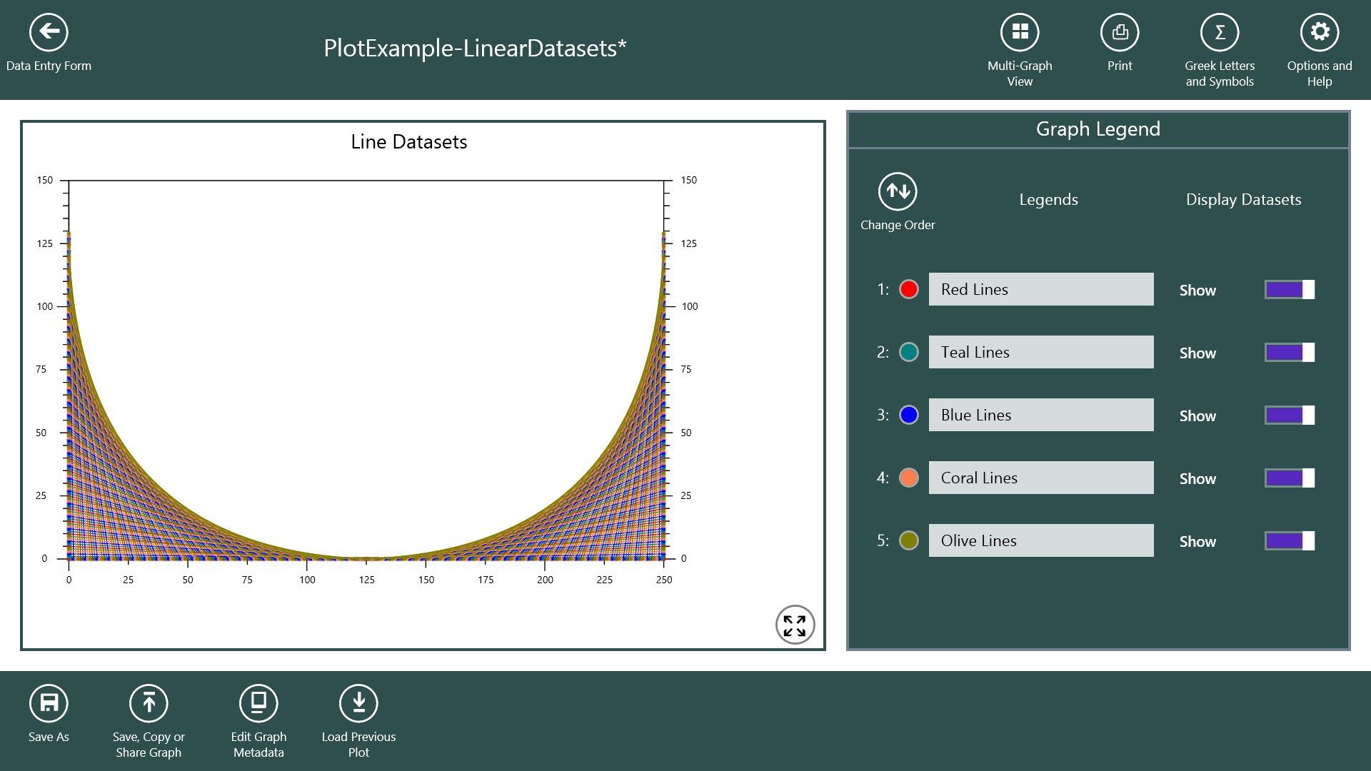
  • Plots 1 to 10 overlapped datasets which are highly customizable.
  • Graphs can be printed, saved, copied and shared and data can be exported.
  • Individual graphs can be viewed and viewed in a slide show.
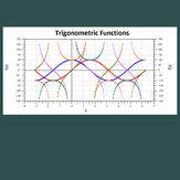
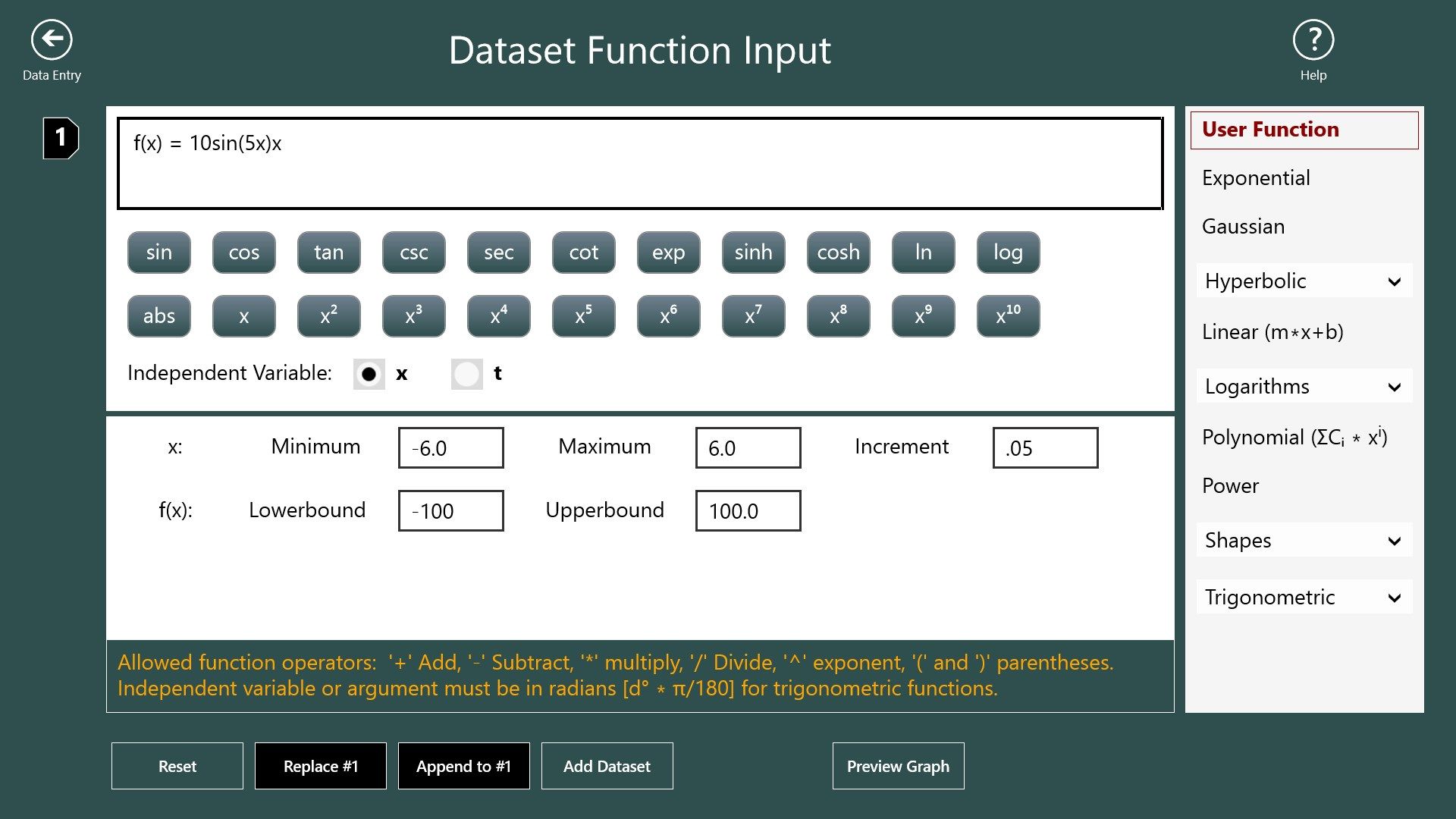
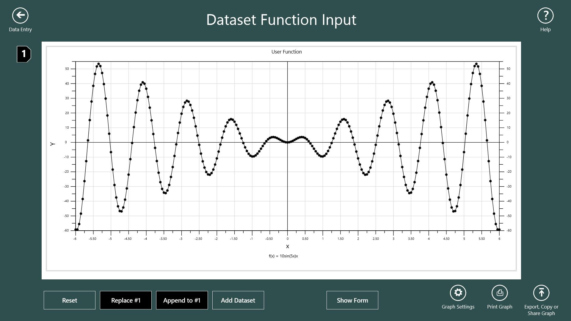
  • A special view is provided which allows plotting of standard math and shape functions with user specified parameters.
  • User functions or equations can be entered and their calculated values used to create X,Y datasets.
  • Symbols at data points and lines connecting data points can be shown or hidden.
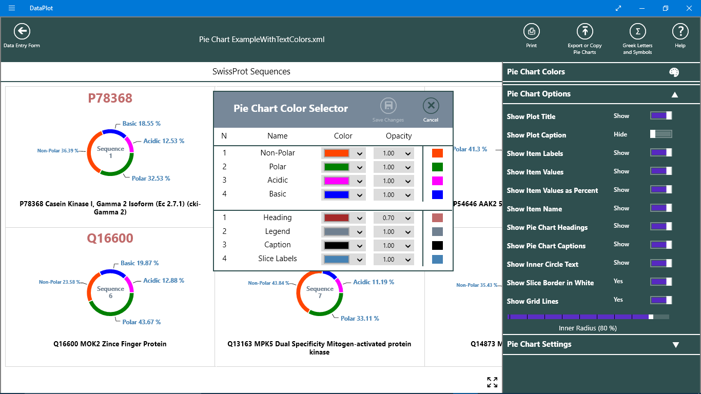
  • Customizable Pie Charts and Ring Charts using Item-Names and Item-Values from 1 to 10 datasets can be created.
Product ID: 9WZDNCRDGVPX
Release date: 2014-10-01
Last update: 2021-04-15