

Description
Telerik UI for Xamarin is a library of native and customizable UI controls for building stunning cross-platform mobile applications for the most popular mobile platforms including iOS.
This application shows scenarios developers can achieve using Telerik UI for Xamarin. Browse the examples to get the first-hand experience with the suite. A Source code preview is available for every example.
Telerik UI for Xamarin key components:
Predefined Theme, Design-Time Support, Localization and Globalization
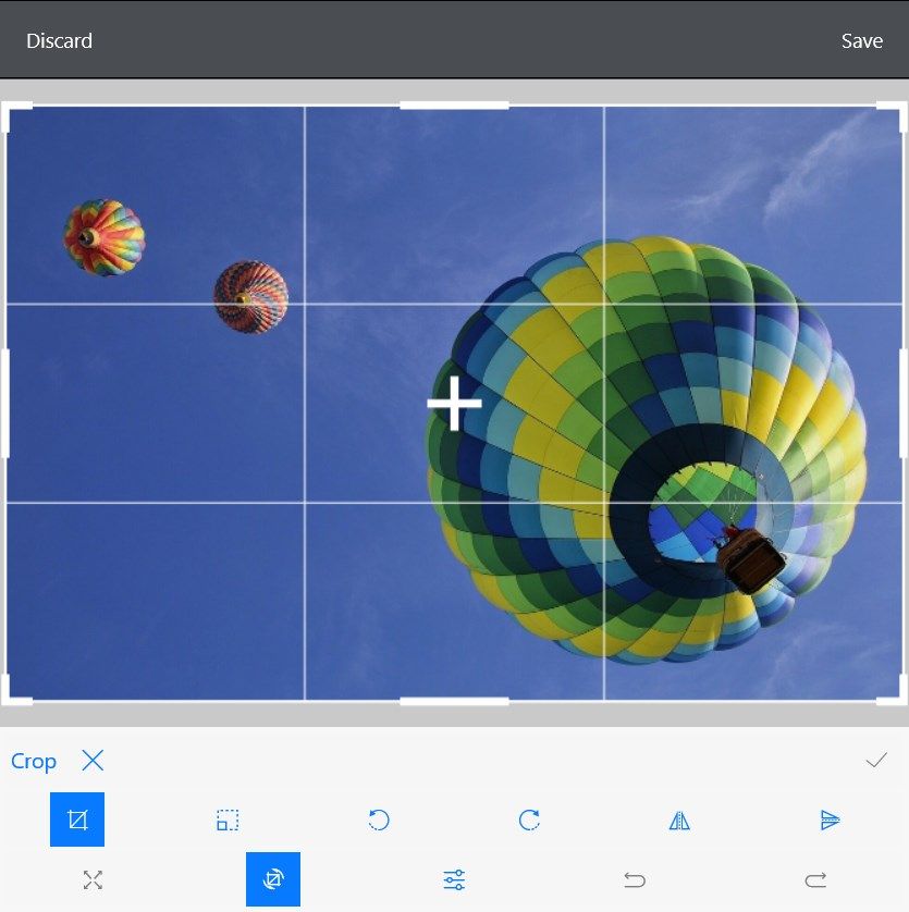
ImageEditor
A control that enables you to easily visualize and edit images in different file formats in your mobile application.
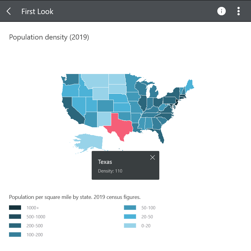
Map
A data visualization control whose primary purpose is to visualize rich spatial data. The control provides visualization of ESRI shapefiles that consist of geometric objects, such as lines, polylines and polygons.
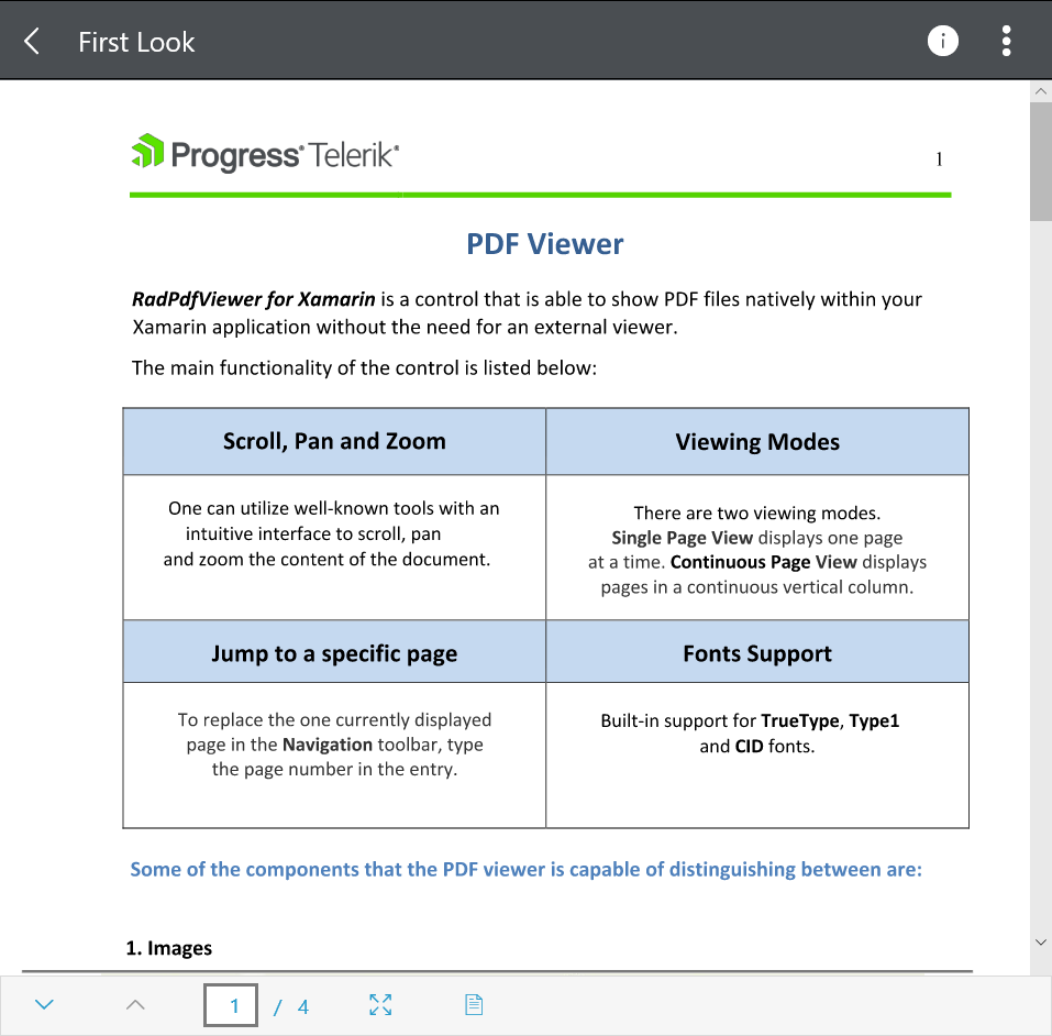
PdfViewer
It enables you to easily load and display PDF documents natively in your application. It comes with full integration with the RadPdfViewerToolbar.
Popup
RadPopup lets you display content of your choice on top of the existing view. The component provides a flexible API to easily control its behavior.
DockLayout
A mechanism for child elements to be docked to the left, right, top or bottom edge or to occupy the center area of the layout.
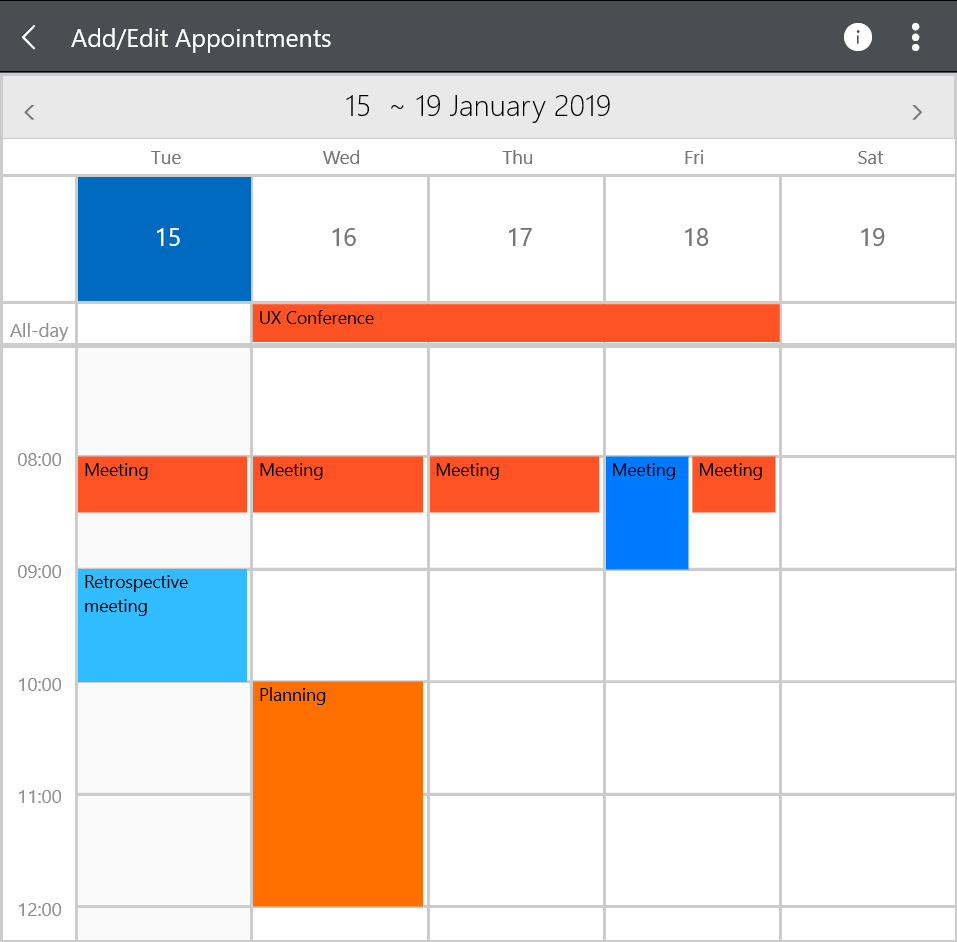
Calendar & Scheduling
The Calendar is a highly customizable calendar component that offers:
•Day, Week, Month, WorkWeek, MultiDay, Agenda and Year views.
•Recurring appointments and built-in dialogs
•Selection
•Flexible Styling API.
Accordion & Expander
Those components help you save screen space and at the same time present the content to the end user in an easily accessible way.
AutoCompleteView
The control has different filtering options, tokens support, and remote search, as well as full customization capabilities.
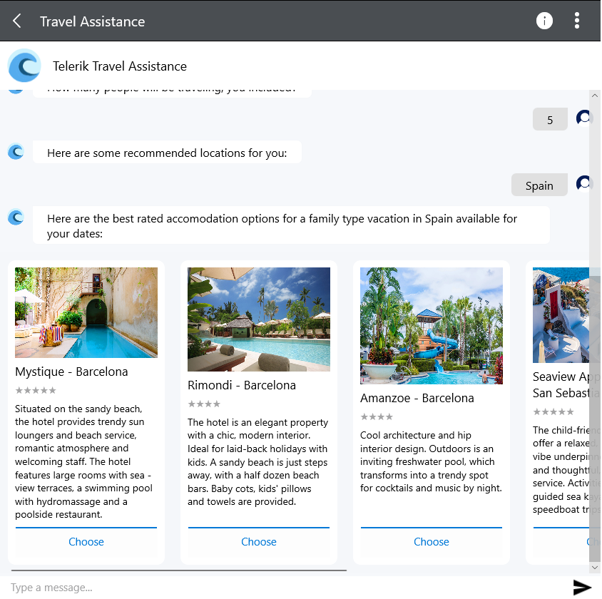
Conversational UI
This Chat component allows you to create modern chat experiences in your apps, regardless of the chatbot framework you choose.
Barcode
Barcode is a control used for creating and showing barcodes.
TreeView
It facilitates management of hierarchical data structures. It comes with commands mechanism, data binding, checkbox support and Load on Demand support.
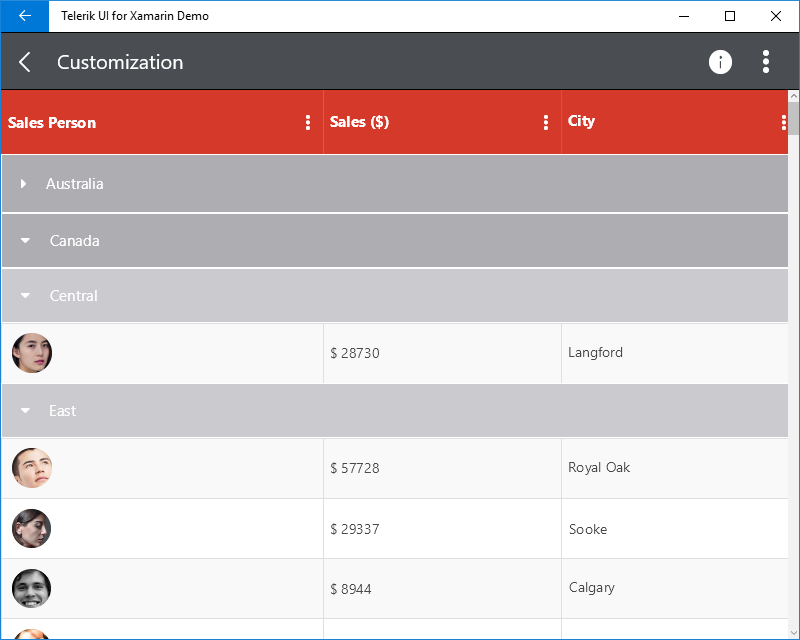
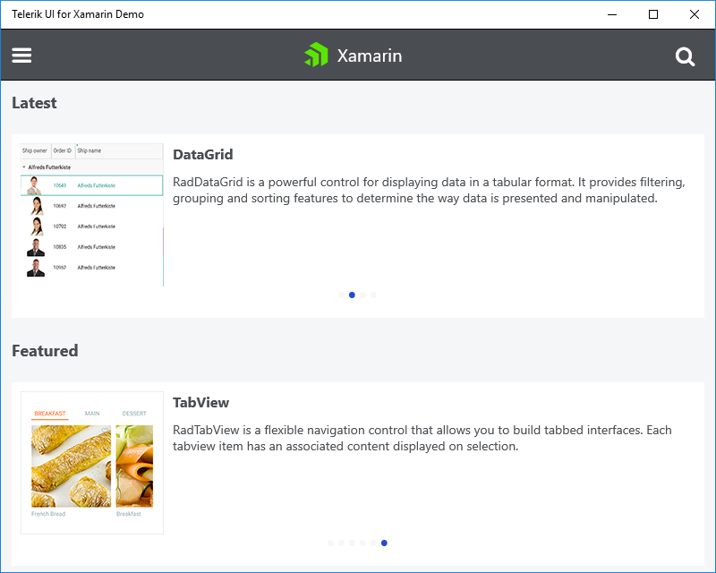
DataGrid
The control provides operations like sorting, filtering, grouping, and editing over the underlying data.
Numeric Input
NumericInput is a highly customizable input control for numeric data.
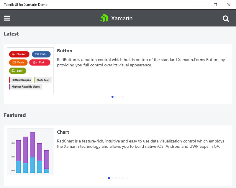
Button
The button UI allows you to add rotation, shapes, transparency, text, and backgrounds and images for a custom look and feel.
ComboBox
Allows item selection from a dropdown list in editable or non-editable modes. Allows single or multiple selection.
SlideView
The SlideView allows users to present content in separate pages and switch between them by swiping.
MaskedInput
Using the MaskInput in your app, you can now ensure correct input is provided by the end users with the support for predefined tokens such as digits, chars, letters, alphanumeric input etc or regex of your choice.
Linear and Radial Gauges
The gauge indicates and gives a visual display of amount, level, or contents of something.
ListView
It provides the most frequently used functionalities. It comes with:
•Different layout modes.
•UI virtualization.
•Pull-to-refresh.
•Selection.
•Commands
•Cells swipe.
•Grouping.
•Styling API.
Chart
A versatile charting component that offers full customization, great performance and an intuitive object model.
•12+ Chart Types
Rating
It allows users to intuitively rate by selecting a number of items [stars] from a predefined number of items.
BusyIndicator
It allows you to display a notification whenever a longer-running process is being handled by the application.
SegmentedControl
This component allows you to display a list of horizontally aligned, mutually exclusive options, which can be selected by the user.
SideDrawer
This steps on the popular navigation pattern where you can access all your application screens from a single sliding menu.
TabView
The component is a flexible navigation control that allows you to build tabbed interfaces.
RichTextEditor
Allows creating and editing rich text content through WYSIWYG interface.
SignaturePad
Gives the option to capture, customize and save a signature.
ProgressBar
Displays progress information during a long-running operation.
-
One C# Project – Three Native Mobile Apps
-
30+ UI Controls for Xamarin.Forms
-
Native UI on Every Platform
-
Native-Quality UI Performance
-
Maintenance and Support
-
Transparent Roadmap
-
10+ Chart Types: Column, Bar, Range Column/Bar, Pie, Doughnut, Line, Spline, Line Area, Spline Area, Scatter and Stacked Charts.
-
ListView, Calendar, Gauges and more components for achieving common mobile scenarios
-
Predefined Visual Studio templates
-
Visual Studio Integration
-
Project Wizard for easily creating mobile application from scratch