

Description
Essential Studio for Xamarin is a comprehensive collection of components for the Xamarin.Forms application development platforms. It includes a rich selection of components including charts, grids, list view, gauges, maps, scheduler, pdf viewer and much more.
This app helps developers explore the capabilities of all the components included in the package.
Key Highlights
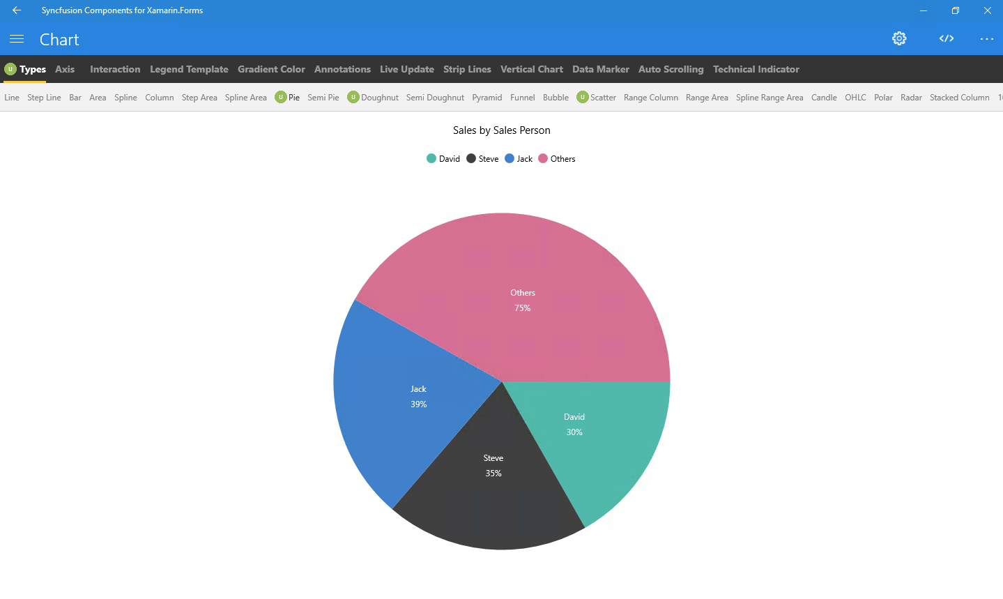
Chart: Plot over 25 chart types ranging from line charts to specialized financial charts.
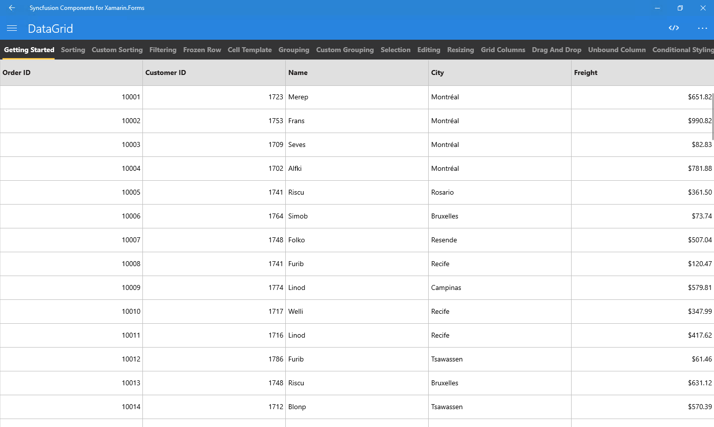
DataGrid: Full-featured grid control with advanced features like grouping, sorting, filtering and export to excel.
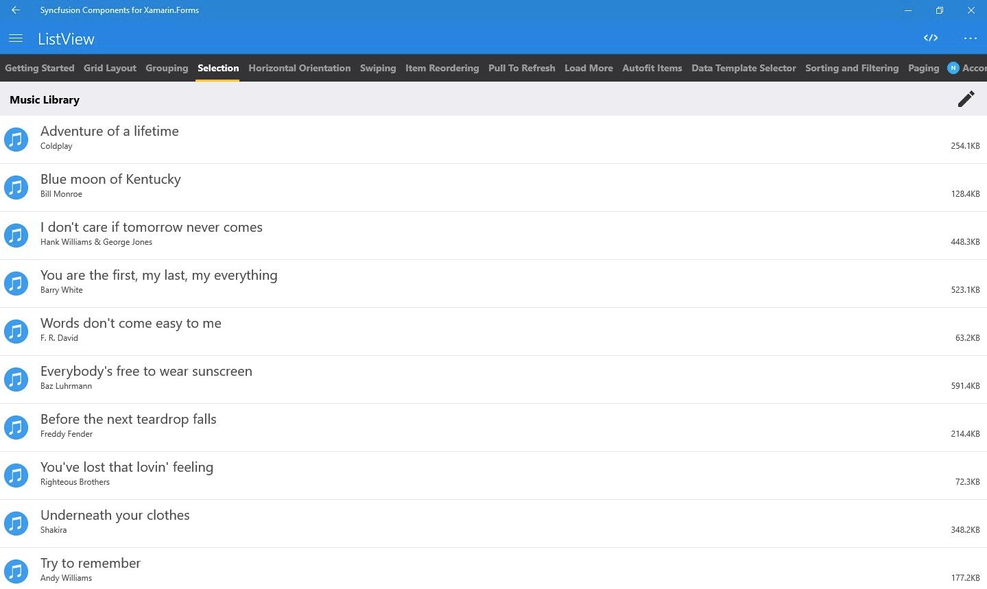
ListView: Advanced ListView component with features like grid layout, grouping, pull-to-refresh and filtering.
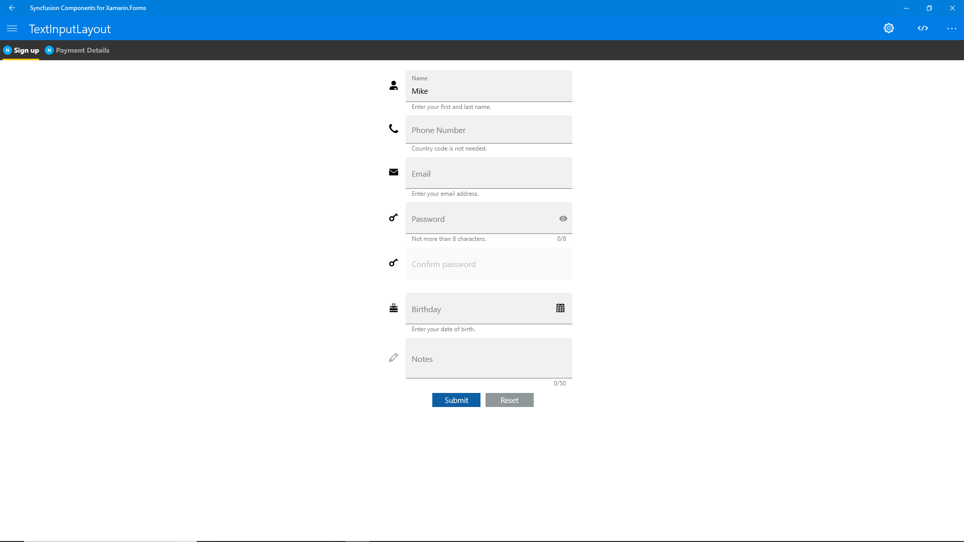
TextInputLayout: The text input layout control adds decorative elements like floating label, icons, assistive labels on top of input views such as masked textbox, numeric textbox, entry and editor.
PDFViewer: High performance PDF Viewer component with features like search, zooming and text selection.
Autocomplete: Provide useful suggestions to users based on the already typed content.
NumericTextBox: An advanced version of the text box control that restricts input to numeric values.
Calendar: Month-View calendar interface for displaying events and selecting dates.
NavigationDrawer: The navigation drawer control is a sliding panel that can be used to hide content like menus from the visible area of the screen.
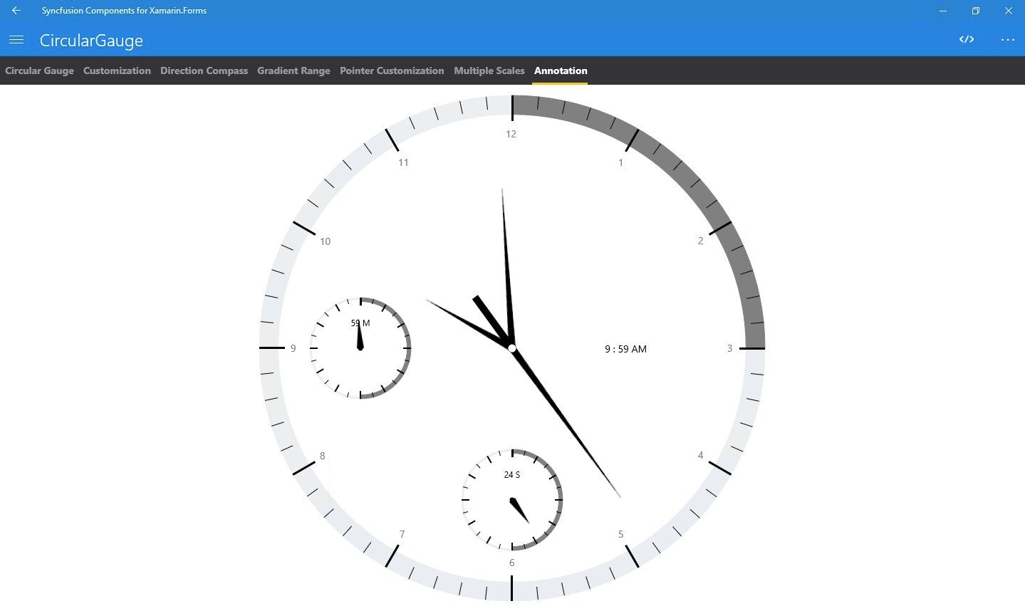
Gauges: Visualize numeric data using Circular, linear and Digital gauge controls.
MaskedEdit: The MaskedEdit control allows the user to restrict the input to certain types of characters/text/numbers using a mask pattern.
ProgressBar: Customizable visual indicating the progress of the operation.
Popup: PopupLayout interface that allows the user to display an alert message with the customizable layouts and to load any desired view inside the pop-up.
Diagram: The diagram control allows to create different types of diagrams such as flow charts, use case diagrams, workflow process diagrams, and more.
Range Navigator : The Range Navigator control provides an intuitive interface for selecting a smaller range from a large collection.
Scheduler : Powerful calendar interface with appointment management capabilities.
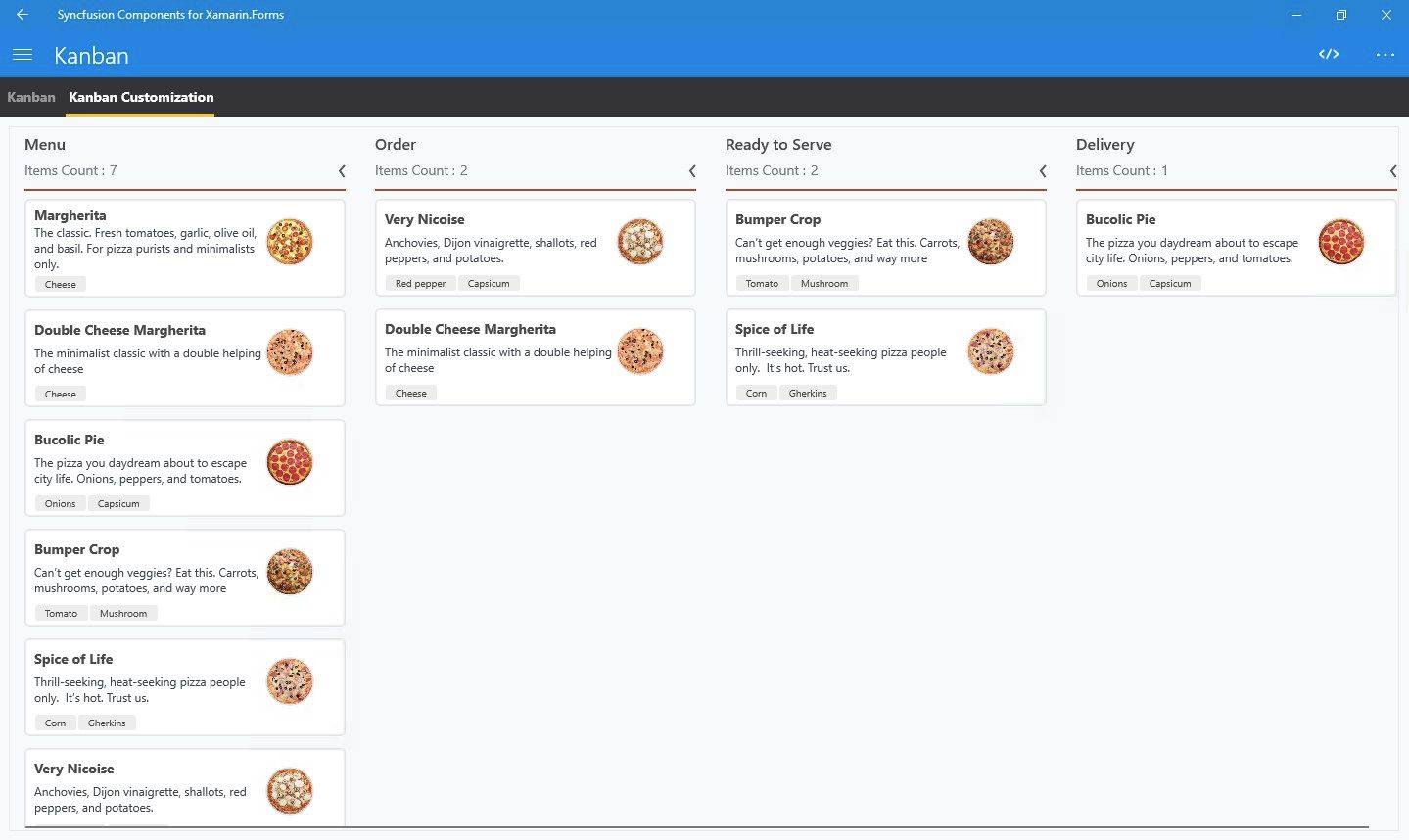
Kanban: The Kanban control provides an efficient interface to track and visualize the different stages in a task or workflow.
Picker: Highly customizable picker control with features like cascading selection.
ImageEditor: The image editor control lets users annotate images with freehand drawing, text and shapes. It is also possible to perform simple image manipulation operations like cropping,flipping and rotation.
PullToRefresh: Panel control with built-in support for triggering refresh when the user performs a pull-down action.
RadialMenu: The radial menu control displays menu items in a circular layout. It can accommodate more menu items in the given space than the traditional vertical or horizontal menus.
SunburstChart: Visualize hierarchical data using concentric circle layout.
Maps: Easily visualize business data over a geographical map.
Treemap: The tree map control provides a simple yet effective way to visualize flat or hierarchical data as clustered rectangles.
Barcode: Easily generate one and two-dimensional barcodes including QR codes within your applications.
Sparkline: Sparkline’s are small charts typically drawn to depict trends in data.
RangeSlider: The Range slider control allows the user to select the range of values within the specified minimum and maximum limits.
BusyIndicator: Pre-built animations to indicate busy status within your applications.
Rating: The rating control allows users to select a rating value from a group of visual symbols.
Carousel: Provides an intuitive interface for navigating through a collection of views.
Rotator: The rotator control provides an interactive way to navigate through a collection of views. Various navigation options like swiping, auto-play and tapping are supported.
NumericUpDown: Restricts input to numeric values and provides buttons to easily increment and decrement values.
DataSource: Simplifies connecting with various data sources and performing operations like sorting, filtering and grouping.
Calculate: Powerful calculation engine with support for over 400 predefined functions.
XlsIO: .NET class library for creating and modifying Microsoft Excel workbooks.
DocIO: .NET class library for creating and modifying Microsoft Word documents.
Presentation: .NET class library for creating and modifying Microsoft PowerPoint files (.pptx)
PDF: .NET class library for creating and modifying PDF documents.
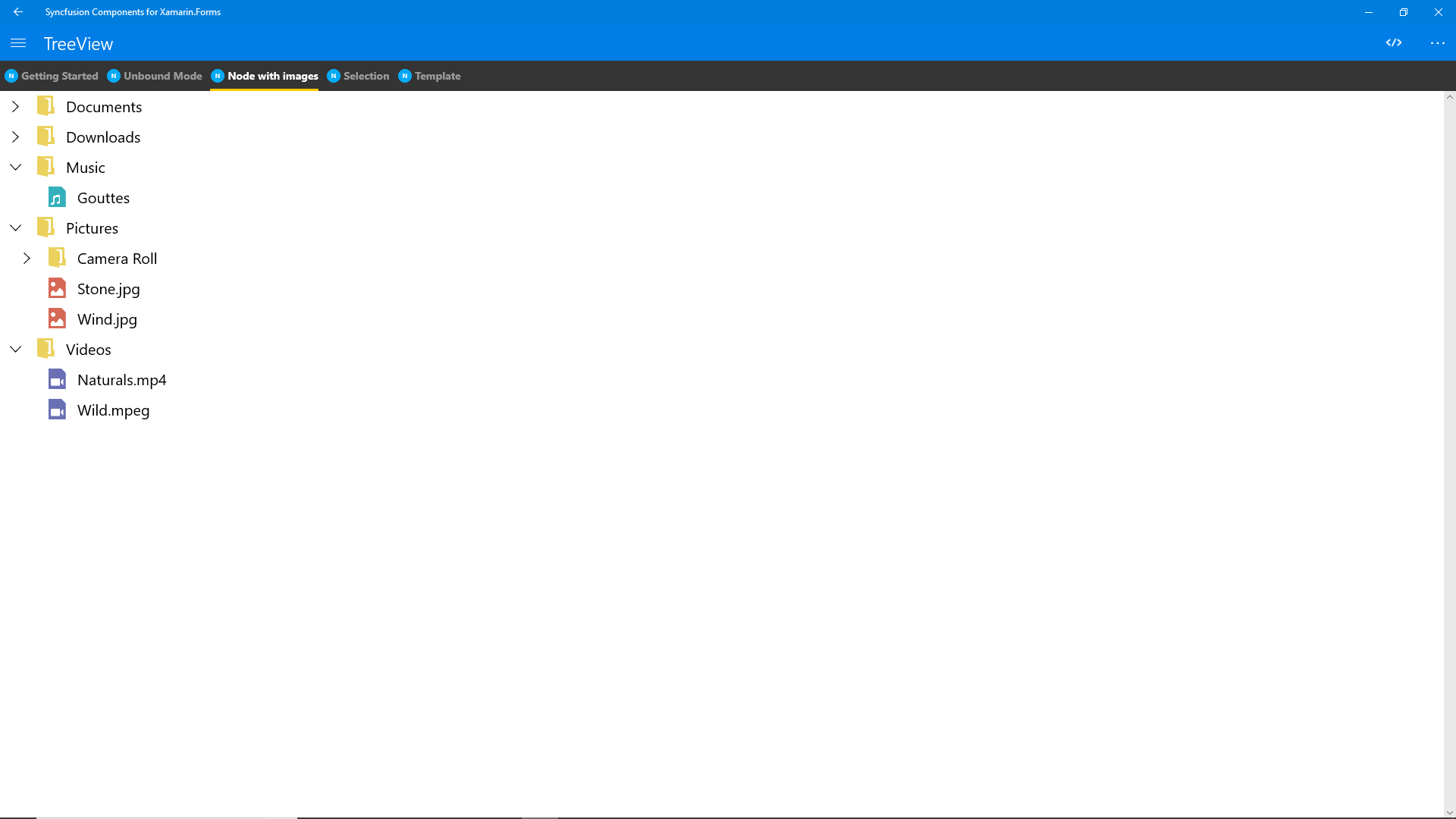
TreeView: TreeView is a data-oriented control that displays data in a hierarchical structure with expanding and collapsing nodes.
Backdrop: Backdrop appears behind all other surfaces in an app, displaying contextual and actionable content using back and front view.
Border: Border is the container control that’s draws a border, background, or both, around another object.
Button: The Button control allows you to perform an action by clicking on it and has the feature of displaying both text and images.
BadgeView: BadgeView is a notification control consists of small shapes such as circle and rectangle which contain a number or message. It is used to show the notification count, messages and status of something.
Chips: The Chip control presents data in precise way with an image and text. The Chip group control arranges multiple chips in a layout as a group with selection.
ParallaxView: ParallaxView is a visual element that binds the scroll position of a foreground element (e.g., a list) to a background element (e.g., an image).