
Description
We all know what happens when we let our software do ALL the work, right? You get that awful disease called “Preset-itis”: a condition where your creative work is indistinguishable from everyone else’s.
Although most software can make some good, generic typographical decisions, it is up to you to deploy all the available tools to enhance the communicative power of your ideas and to make your type as readable and as impactful as possible! To do so, you must become an expert in Typography. So, let’s get started…
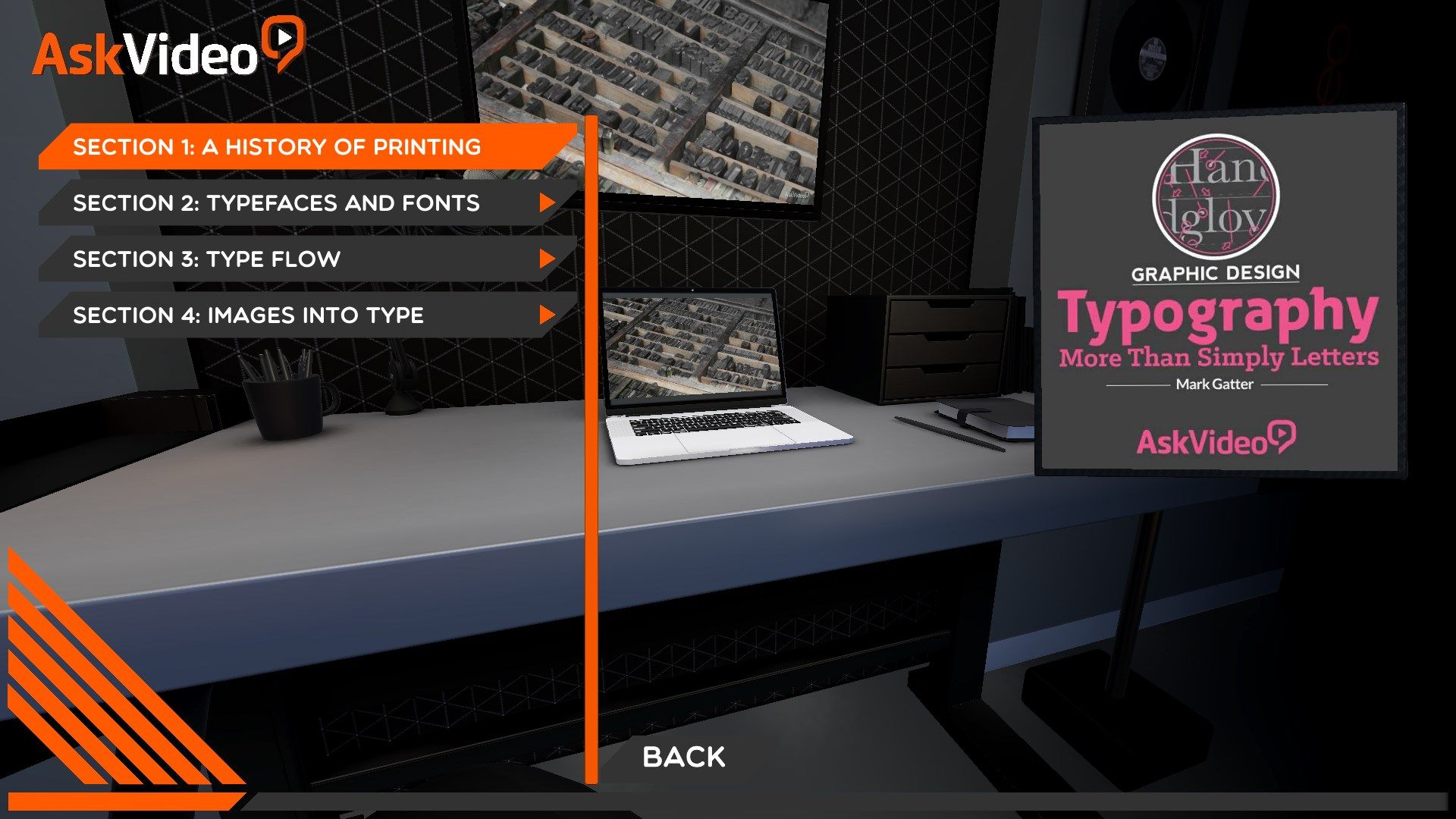
This course, designed by graphics expert Mark Gatter, immerses you deeply in the art and craft of Typography. You first cover a little important history from hand-drawn texts to the Gutenberg Bible. You learn about Typography’s development over time, from moveable type to offset lithography through to digital type realized in Adobe Illustrator and Photoshop. Most of all, you see how and WHY these techniques were developed and what they mean to you in today’s technological world.
With this time-proven knowledge in your graphics toolbox, you then move onto the section on Typefaces and Fonts. This is where Mark explains the myriad techniques that infuse simple words and letters with intention and impact. You learn about the power of font choices. You see how to enhance readability using Leading. You get lessons on the aesthetics of Kerning and much, much more. Most of all, you see these concepts in action with tons of excellent examples and in-depth explanations.
There’s so much to learn in this course that mere “words” do it no justice! So just sit back, switch to HD, hit the play button and get ready for some great typographical inspiration delivered by the always thoughtful and entertaining master of all things graphic: Mark Gatter!
-
Featuring our industry specialist trainer, AUTHOR!
-
This course on XX will show you everything you need to know!
-
Including a fully interactive interface!
-
With XX videos, and X hour and XX minutes of valuable reference material!
-
So if you're looking to learn XXX, look no further...
-
This Ask.Video course is the best and fastest way to learn it !
